NGFCU Signage
Lead the planning, design, and coordination of environmental branding
across secure Northrop Grumman campuses nationwide.
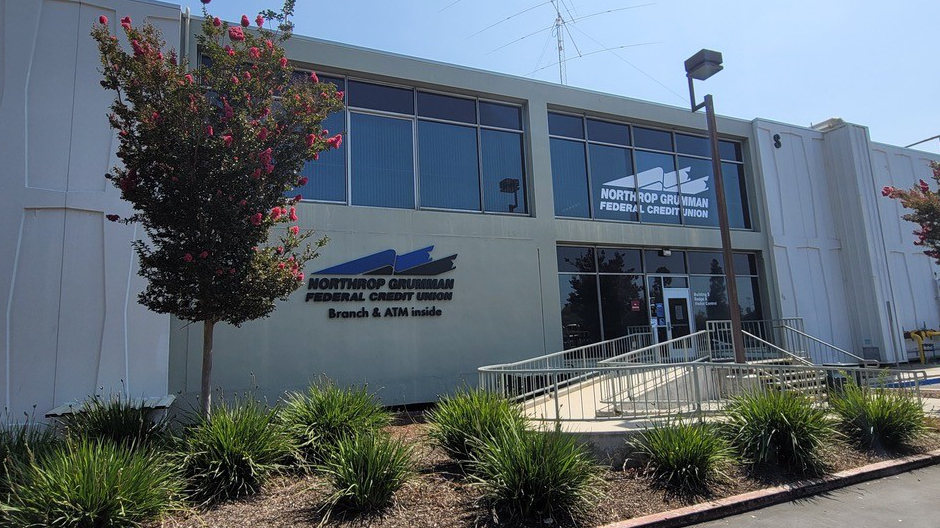
NGFCU reaches our members where they work by planting small branches on Northrop Grumman campuses. We are constantly looking for ways to increase awareness of our presence to better serve our sponsors. One way in which we accomplish this is by planning cost effect measures to have the most visual impact to let NG know that the credit union is here.
Because NGFCU operates branches within secure Northrop Grumman facilities, increasing brand visibility presents unique logistical and regulatory challenges. My role was to develop signage that increased awareness of branch locations while respecting strict security protocols at Northrop Grumman, architectural standards, and operational constraints.
My multifaceted role in this endeavor was to conceptualize and produce indoor and outdoor signage, coordinate with vendors for production and install, as well as coordinate with Northrop Grumman facilities to ensure installation followed local codes, on sight scheduling and security clearance.
In my time with NGFCU, I have successfully lead the installation of:
- vinyl window wraps
- frosted window wraps
- canvas banners
- wall artwork
- outdoor marquee signage
Creative Leadership
Project Management
Stakeholder Coordination
Lead
Production
The Challenge
Having Northrop Grumman as a sponsor group for a national credit union comes with it’s unique challenges in all facets of creative direction. Due to their highly secure protocols, every single detail of even the smallest on-site project requires coordination across multiple departments before production can begin.
Each project involved:
- Multiple rounds of internal and sponsor group approval
- In house 3d mockup
- Vendor-Produced engineering drawings
- Facilities coordination
- Security clearance
- Scheduling installation around classified operations
- Careful placement that balanced both visibility with campus requirements.
The designs and artwork themselves only became one part of a much larger process of systems-planning.
Attempting to install signage in and on NG campus took months of negotiating and planning to make happen. Not only did we need to acquire quotes and drawings from the vendor, we had to approve those details through multiple departments at NG corporate. The building needed to be tested for harmful particles. Contractors had to be vetted and given escort privileges. Location of install needed to be non intrusive to NG, while still being visible enough to be worth the cost.
Creative Strategy
My primary focus when overcoming these challenges was to maximize visual awareness without competing with surrounding architecture by treating each installation as an extension of the environment. This means keeping things intentional and integrated while reinforcing NGFCU’s long-standing partnership with Northrop Grumman.
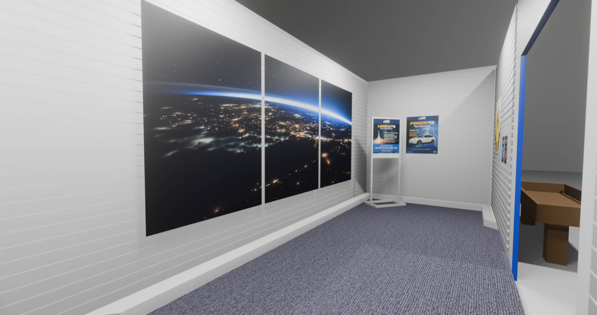
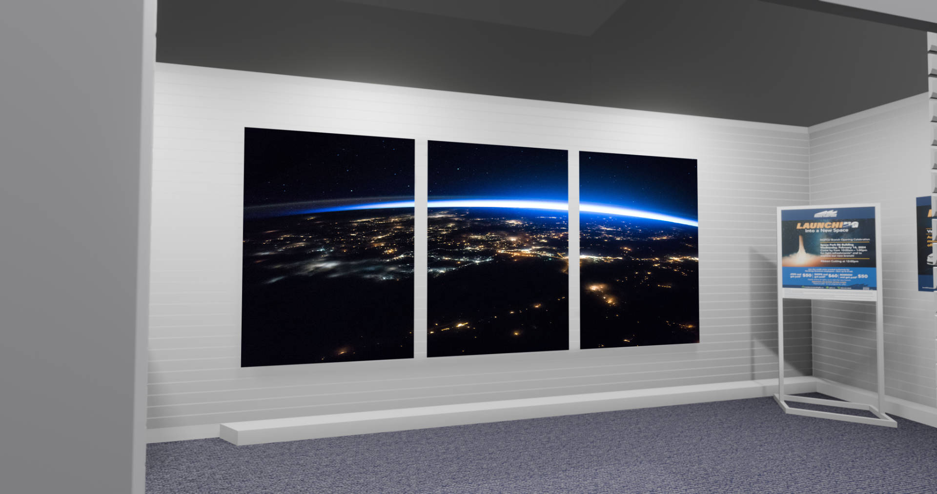
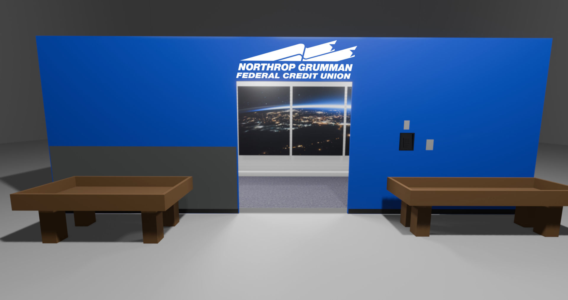
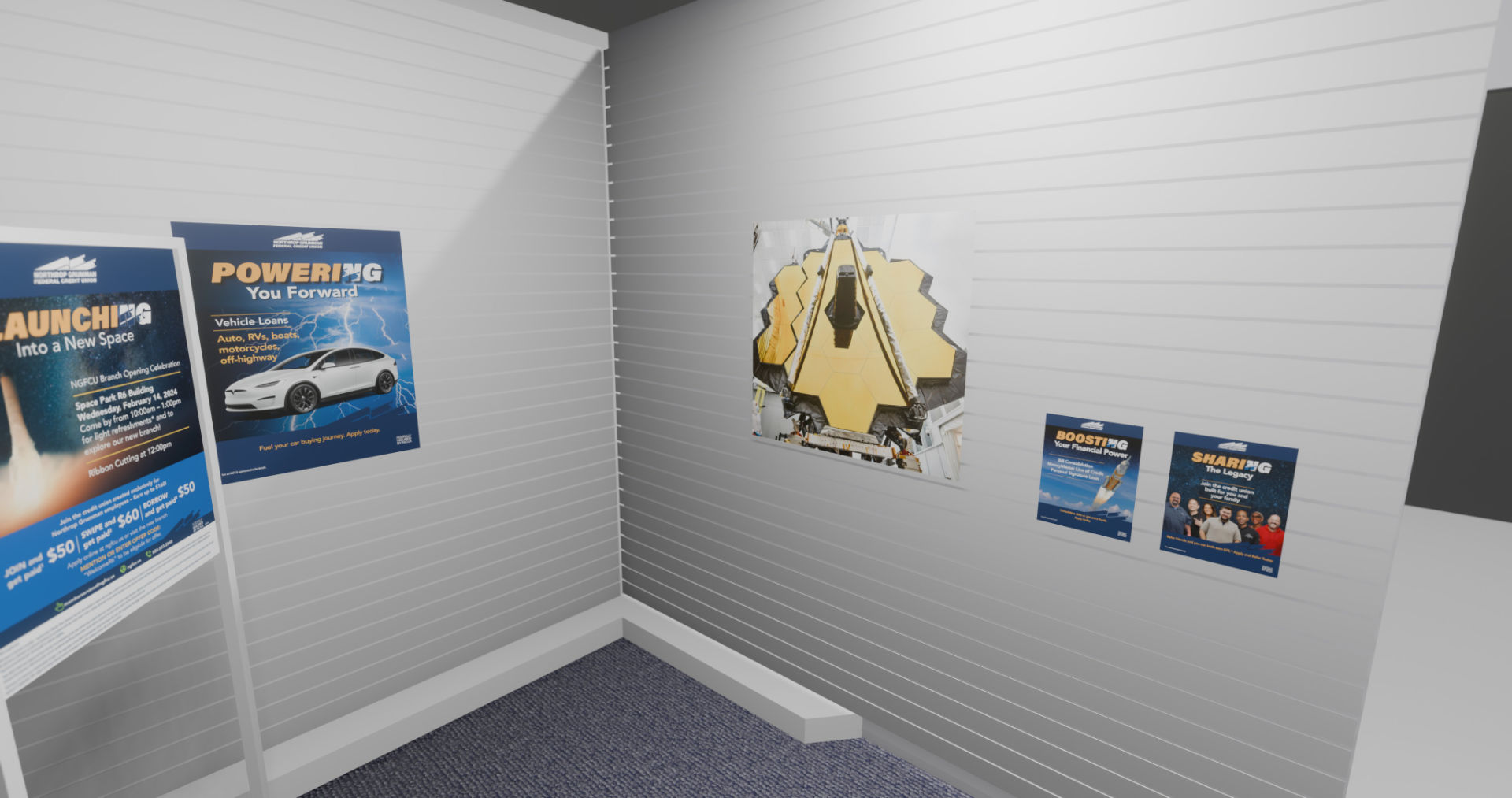
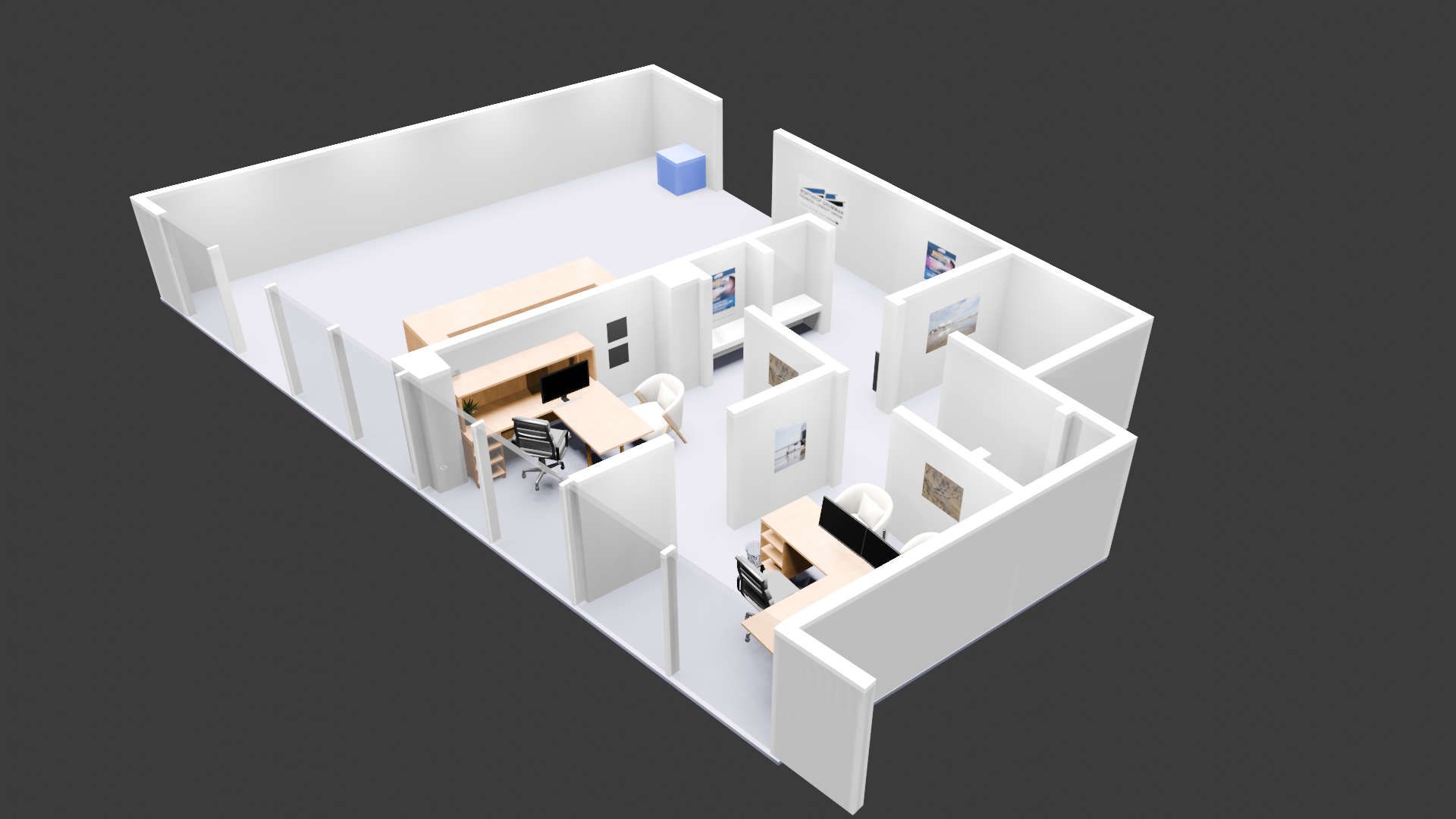
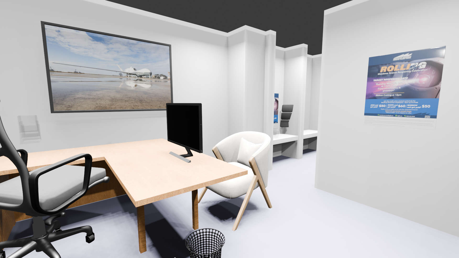
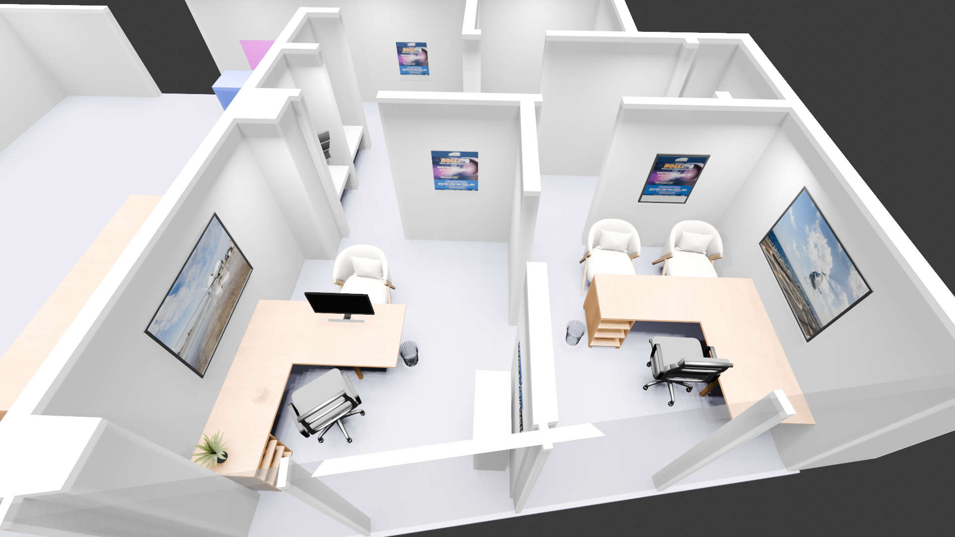
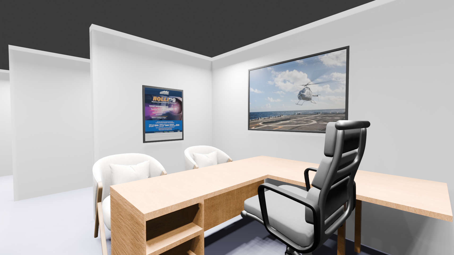
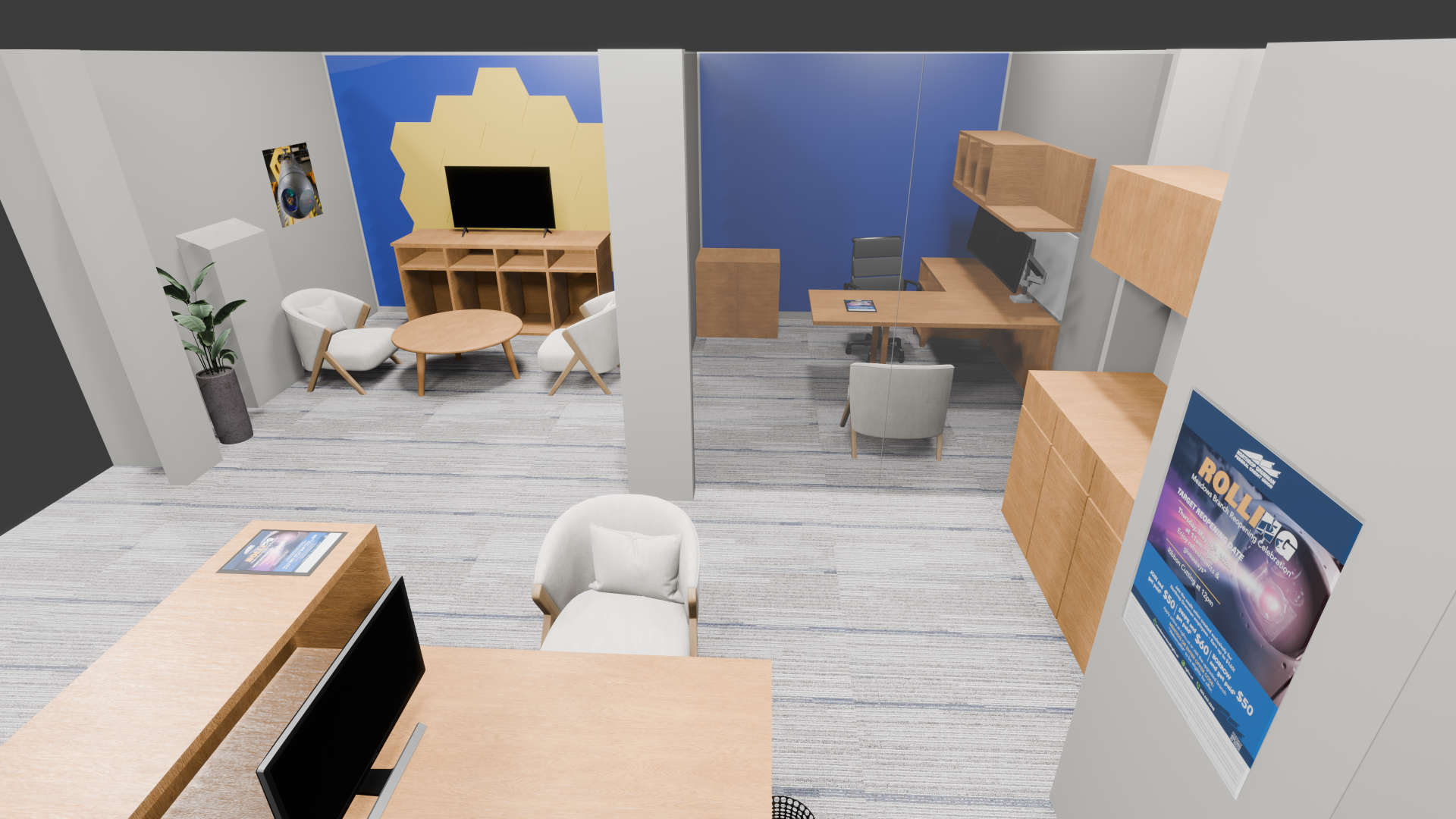
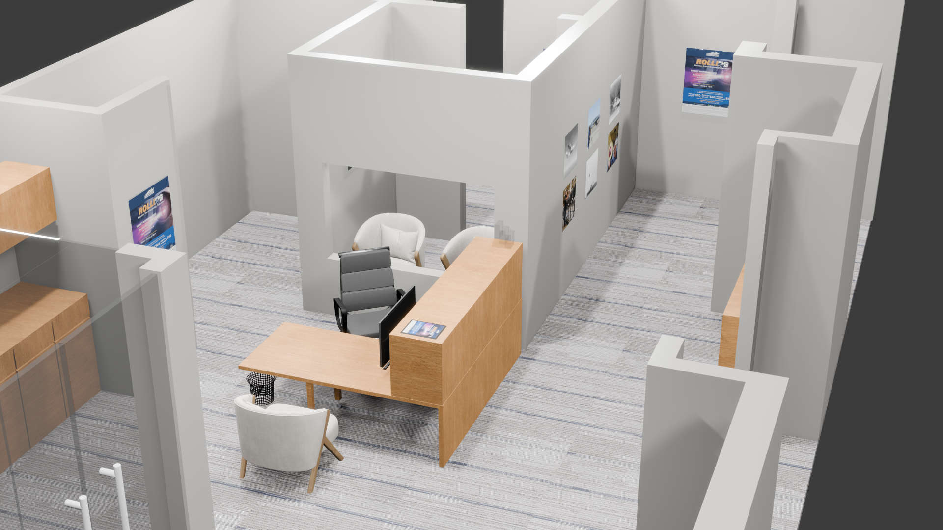
3d mock ups using Blender
Manhattan Beach Branch:
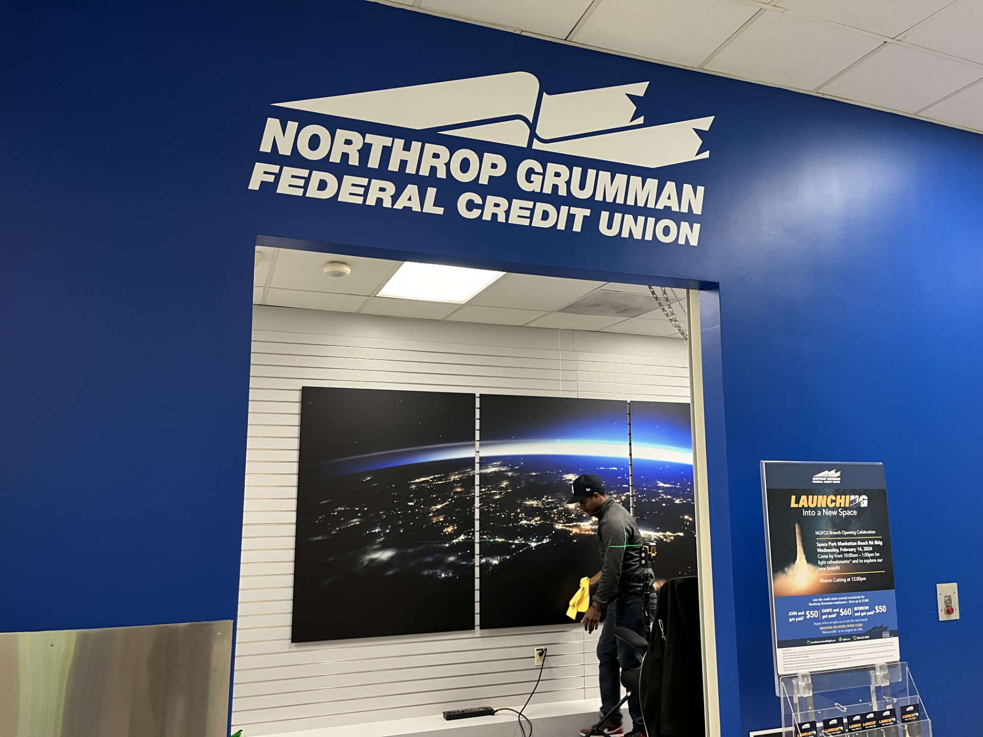
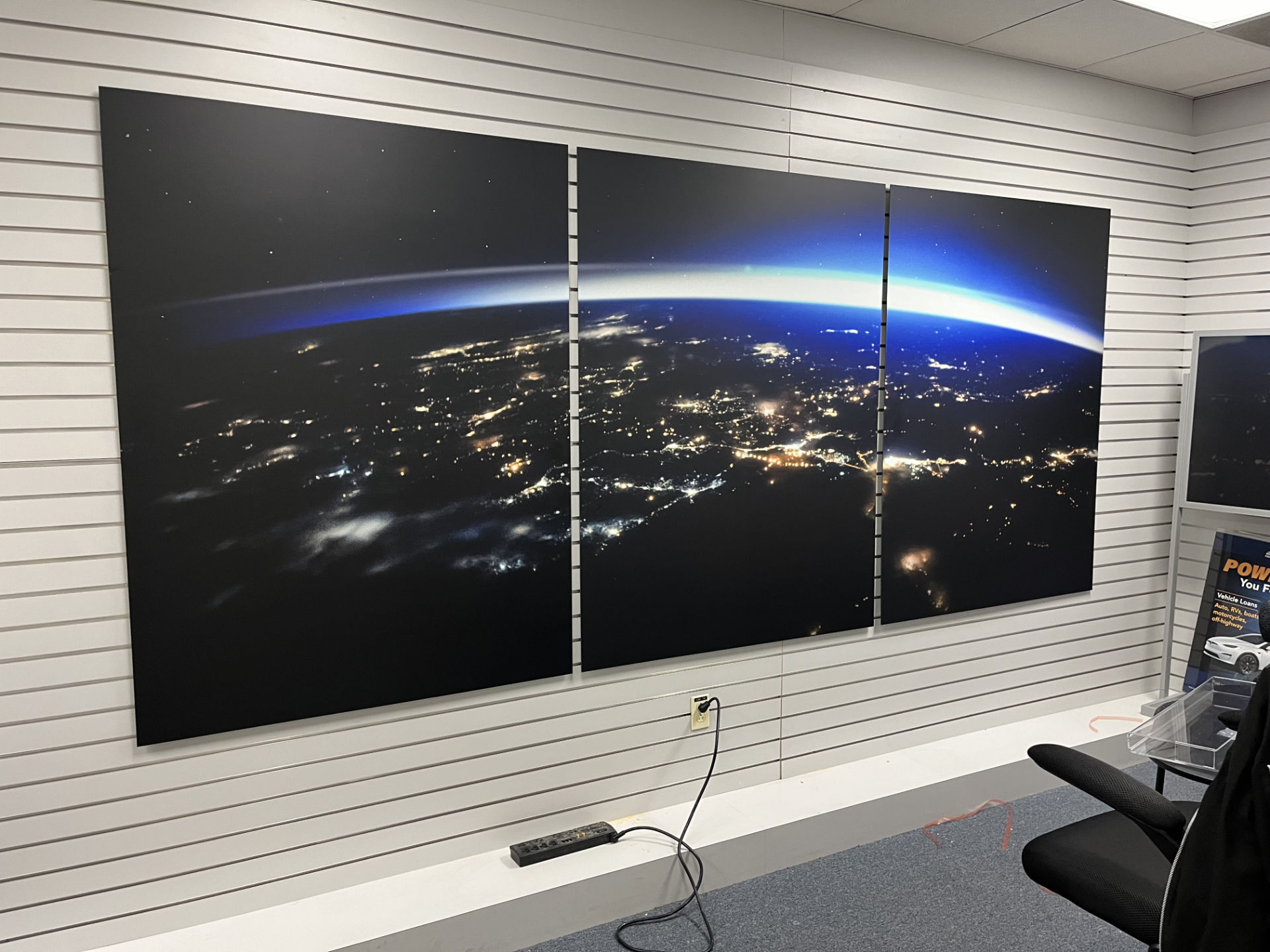
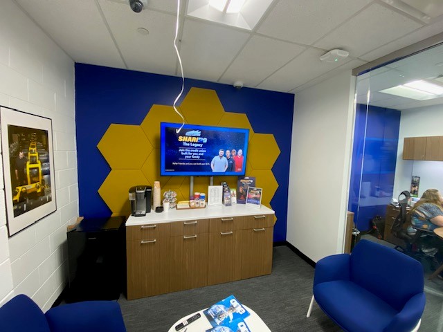
The Manhattan Beach Branch was my first journey into designing branch signage and artwork for the credit union. This branch was a small room, not much larger than a utility closet. Located in the back of a cafeteria on campus, which required badge entry by employees – our strategy was to turn a bland back wall into a bold accent wall!
Final photos from campus
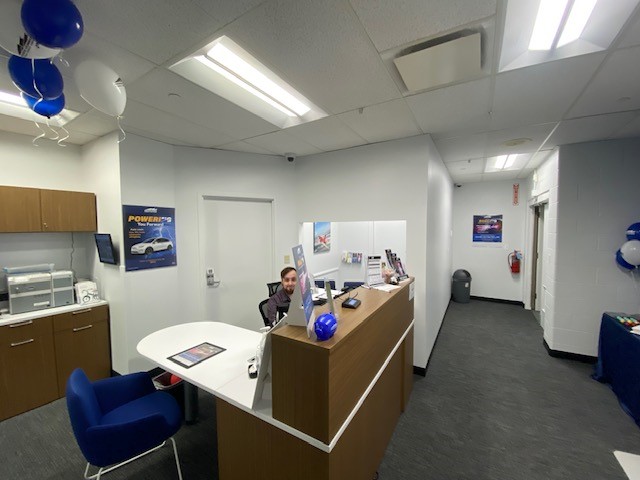
NG has a strict photo policy, so we are limited on what we can capture inside.
Monument Sign:
Quite possibly the most challenging undertaking of my career. Building S shared a branch with our number one competitor at the time, Unify Credit Union. They had a premium location that didn’t require badge entry and signage already on the building. We needed to draw attention to our presence on campus and away from them!
The monument sign served as the primary visibility anchor for the Space Park branch. It needed to say one thing, “We are here to serve you.” Since most employees approached from the main parking lot, we chose a location that maximized visibility during normal operating hours.

Online Banking Logo
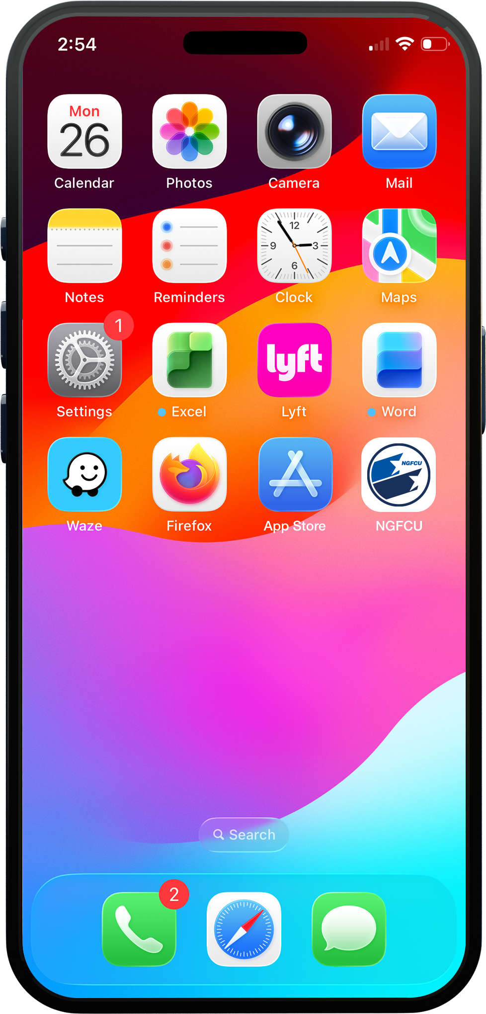
I designed this simplified logo solely for launch. The original logo for the credit union is too wide for readability on mobile platforms and app store icons. Furthermore, I wanted something more modern, but still visually recognizable to our members.
By reducing the complexity of the logo design, the logo could work across future digital products, mobile applications, browser icons, and other materials.
Window Wrap:
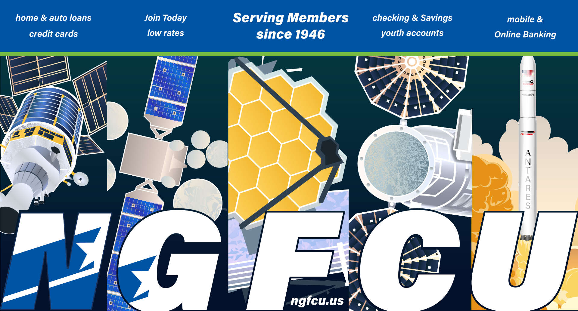
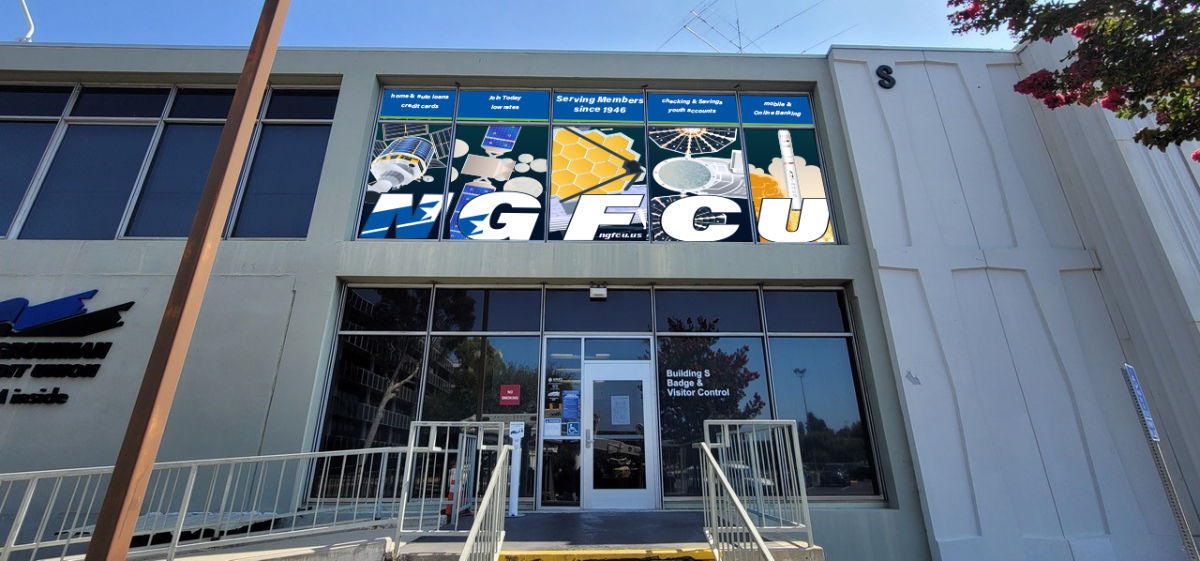
Unfortunately, there was a complaint by an employee at Spacepark that the vinyl that was used on the windows was not see through enough. So we had to remove the original vinyl logo and try again.
This turned out to be a great opportunity for me to convince stakeholders on a more interesting design. Rather than a repeat of our logo.I wanted to create custom aerospace illustrations that reflected technologies familiar to Northrop Grumman spacepark employees. By juxtaposing our Credit Union brand with iconic NG tech, we help to remind current and future members of our long term relationship.
Palmdale Pillow banner:
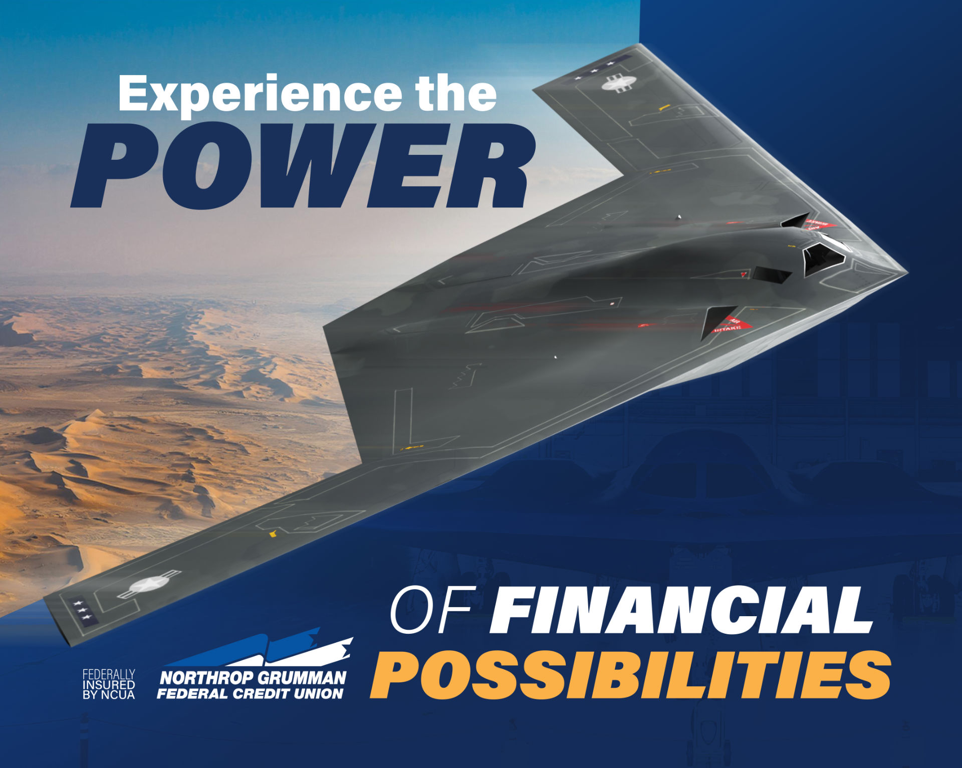
To effectively visualize the surrounding high-desert environment at Palmdale, I utilized AI to help create a realistic birdseye view of a southern California desert landscape. I then composited a custom 3d model of the b-21 aircraft flying overhead. This hybrid workflow significantly reduced production time while maintaining control over the final result.
Frosted Window Signage:
At one of our branch remodels, there were two primary offices that had daily private meetings with members. The problem was that these offices shared a full glass door between them and our facilities team requested a solution to help with privacy. By utilizing a frosted window wrap with subtle credit union branding, it helped keep each space separate without being overbearing in the tiny offices. Being part of the space, instead of dominating the space.
RB3 Branch Artwork:
Keeping with the goal of synergizing our credit union culture with NG, I sought to utilize mostly historical photos of Northrop Grumman as our art pieces. I worked with NG marketing to compile photos that had been approved for print and chose which ones to use in our branches. Each branch serves a different sector of NG, so I used this to help narrow down what imagery to utilize in my branch installations.
Rolling Meadows Branch Artwork:
Keeping with the goal of synergizing our credit union culture with NG, I sought to utilize mostly historical photos of Northrop Grumman as our art pieces. I worked with NG marketing to compile photos that had been approved for print and chose which ones to use in our branches. Each branch serves a different sector of NG, so I used this to help narrow down what imagery to utilize in my branch installations.

Gilbert Arizona Branch:
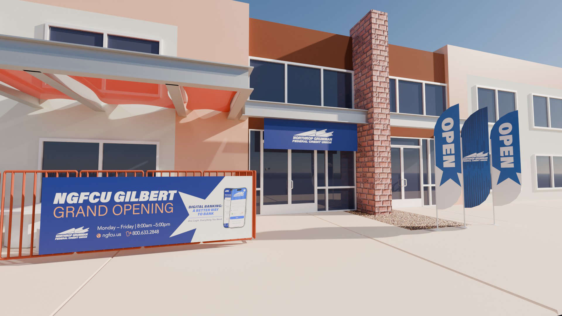
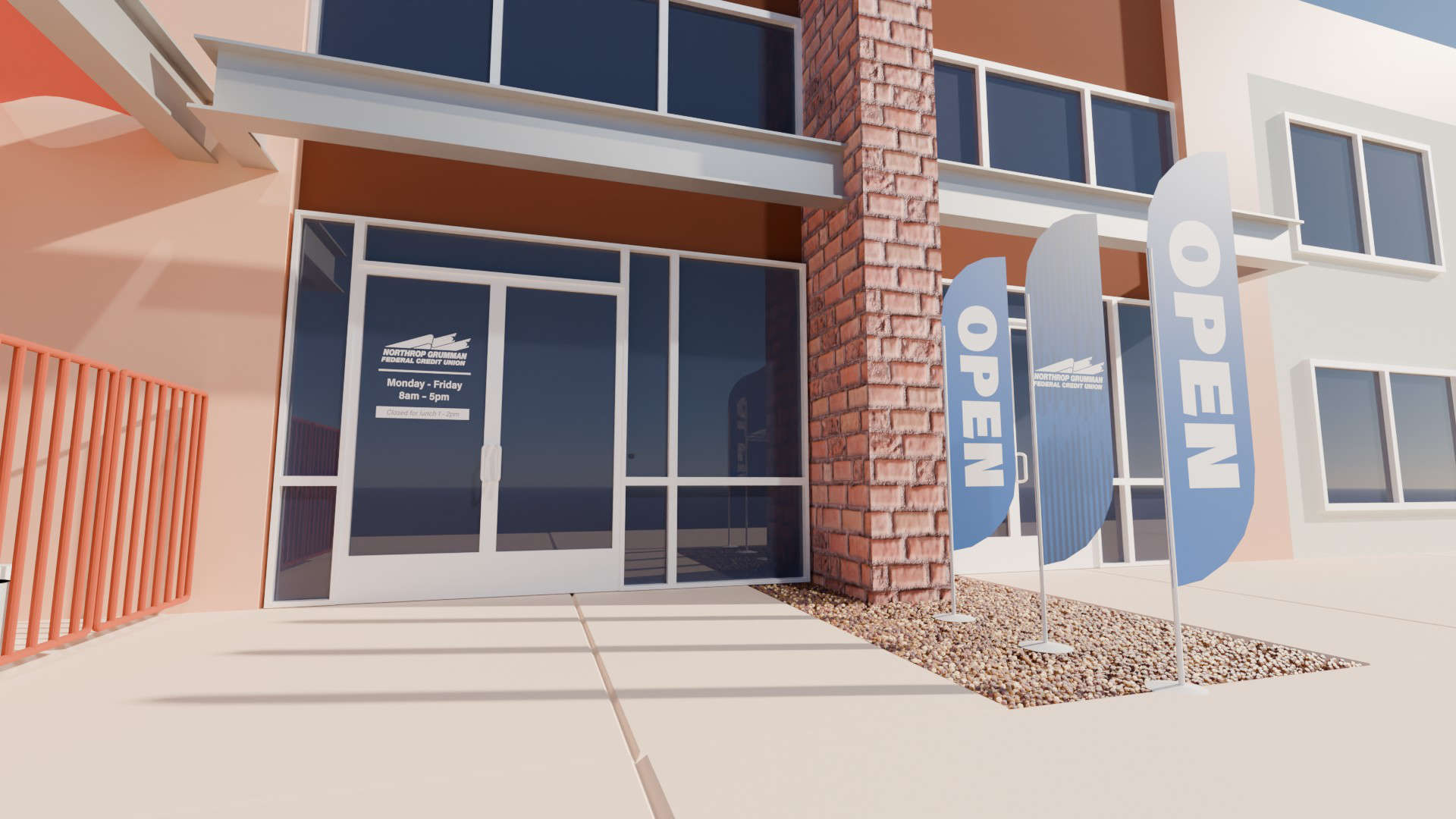
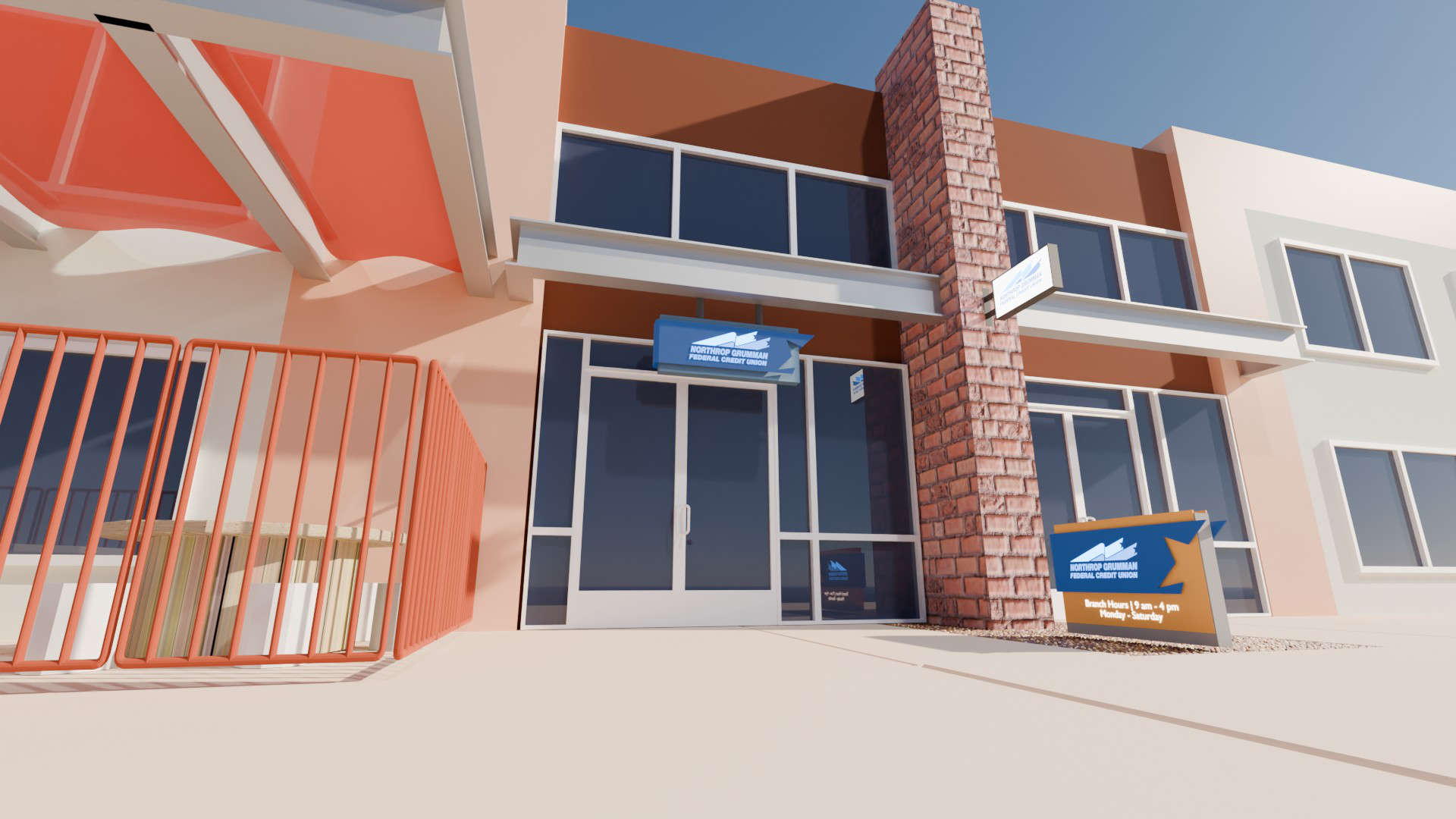
This is the most recent project that I was asked to design signage options for. The branch facilities manager is uncertain what we can actually do on this site, since the building itself is fairly new. Therefore, I was asked to provide a range of signage options that were both temporary and permanent.
Working closely with project stakeholders to bring member awareness to our presence.
Since it would be too costly and time consuming to send me to every new branch across the country. I worked with the local NG facility teams to acquire photos and measurements of the physical branches being remodeled. I then made 3d renderings of the space to scale and made virtual installations of the artwork. This helped me visualize where to place things, as well as communicate these plans to both Credit Union and NG stakeholders.
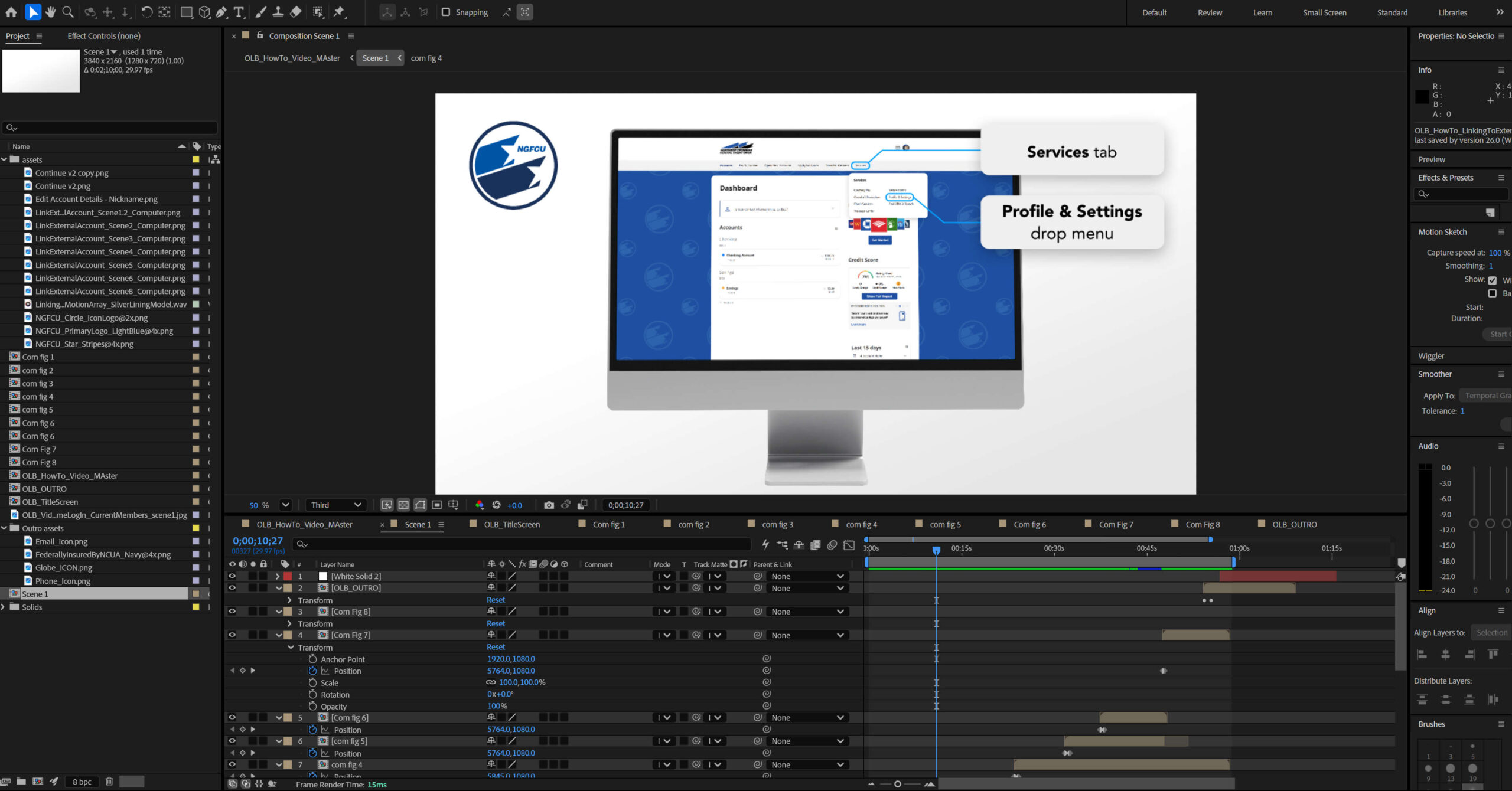
I planned out a scalable production workflow using After Effects that allowed me to produce all 24 videos in as quick as 30 minutes a piece. Rather than treating each video as an independent project, I defined the visual direction, voice of script, and utilized AI voice over to quickly produce all the assets needed. Every element was planned with the ability to be rapidly tailored to each new video as the platform evolved.
Production Constraints:
My Role at a Glance
Results
The most challenging install was the Marquee and window wrap sign at Northrop Grumman Space Park. This was particularly due to the level of red tape involved at NG. I would get approval in one department only to have another department catch wind of the project and contradict the approval. This lead to months of back and forth coordination. The monument signage was successful and received a noticeable uptick in user traffic year over year.
Although the monument signage successfully increased branch visibility, one accompanying vinyl window graphic had to be removed after an employee complained about a visibility concern.
While I do not see this as a failure, it is a learning experience that no matter what you can’t possibly please everyone. No matter how much you communicate intentions, it isn’t until the product is received that you get the most practical feedback. That experience reinforced an important lesson: successful environmental design extends beyond approvals – it must anticipate how people experience a space after installation.